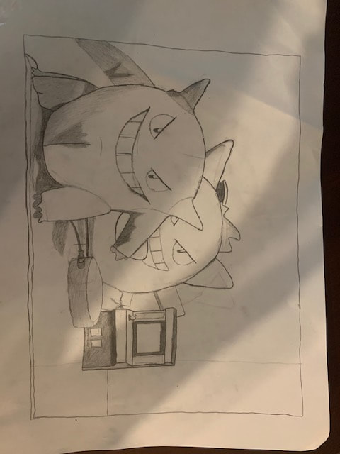
4 Drawings
|
We were assigned to complete 4 drawings over the course of two weeks, each that would require a different set of skills to do.
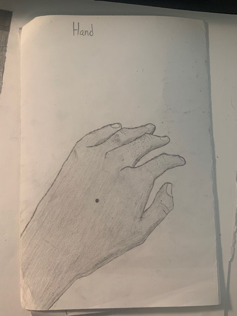
Hand In this assignment, we were supposed to draw a human hand, pretty simple. I took a picture of my own hand and drew it out. It took a few attempts, but I eventually got my sketch right. Then I started to add a few details, such as the gigantic mole at the center of my hand and areas that light couldn't reach as well. After a while, I decided that the shaded areas represented such a drastic change that I decided to lightly shade the rest of the hand to make the shaded sections look more natural. I believe the main skill for this drawing was shading. |
|
|
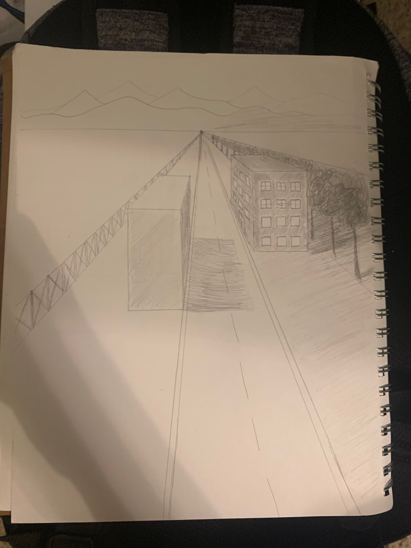
Street
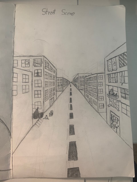
This next drawing is of a street. I remembered learning about drawing hallways in another class so I applied hose skills here. I created a point of origin that everything would seem to shrink towards, which was at the end of the road. Then I created the buildings, which I created by jutting thin lines from the origin point to find hoe to draw buildings of different heights. After drawing the doors and windows, I decided that the scene was too bring and decided to add a bit of detail. The close right building was the most detailed, with every window looking different, whether i was boarded up or there were different designs of curtains on them. The middle left building had a bit of detail too, though less. The other buildings were either too small to be super detailed or not made to be detailed. And of course, what does every city have? Trash! So I added trash bag to make the street look a little more real. |
|
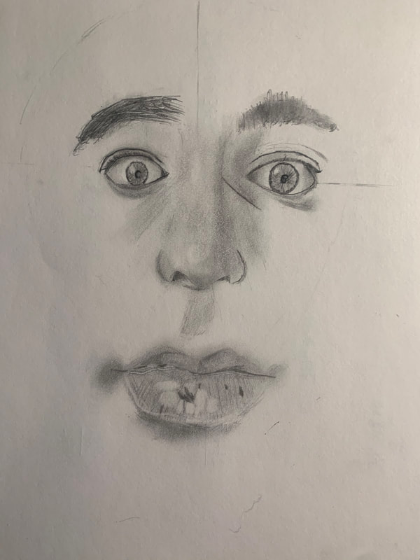
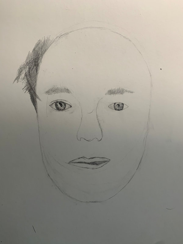
Portrait
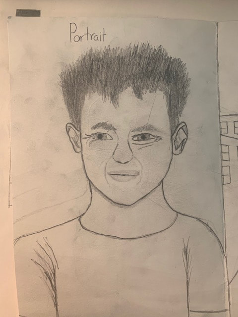
This one was the most difficult for me personally. I am not good at drawing faces, especially mouths. You can even see where I pressed too hard on an earlier mouth and is still there. The ears weren't easy either, it was difficult to make the ears look natural. I am most proud of the eyes, though, the way I drew them makes me look old or tired, when in reality I was squinting in the picture. Overall, it was a difficult drawing to do and I wish I could've done more with it. |
|
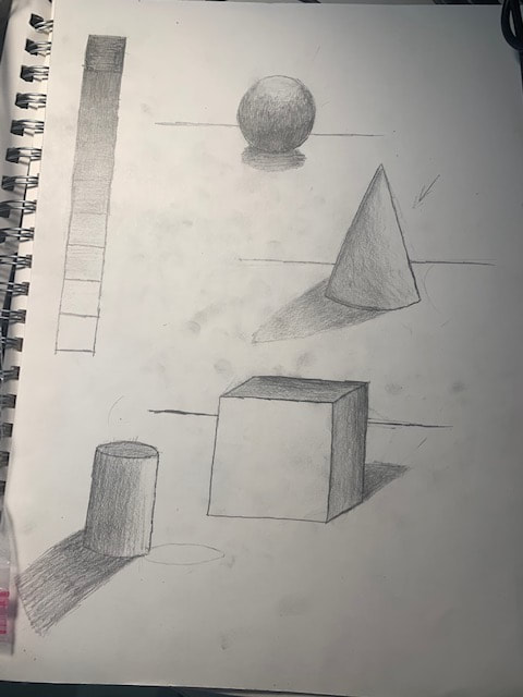
Four shapes and Value Chart |
Pair of Shoes with laces
I vastly underestimated how difficult this drawing would be. It's the little details that really make this particular drawing hard to do. The laces were the hardest since they weren't in places that would be easy to replicate on paper. The little dots and patterns weren't easy to put in a drawing either. I was still somewhat proud of the finished product however. After doing this drawing, I think one of the main things I need to work on in drawing is shading. |
|
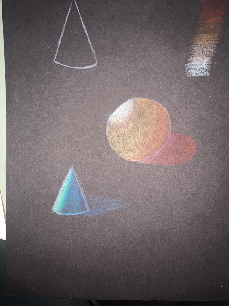
The next assignment was creating a value chart and making 3D shapes using that chart. I created 9 different shades for the chart that started dark and kept getting lighter. The last two look practically identical, but there is a tiny shade on the second-to-last one.
Then we needed to create 4 3D shapes: A sphere, a cone, and cube, and a cylinder. We needed to shade them and add shadows so that they actually look 3D. What we did is pick a place for light to shine from and make the part of the object facing the light be the lightest while the sections farther away get increasingly darker. We also positioned a shadow on the opposite side of the light. |
|
3 Virtual School Photos
|
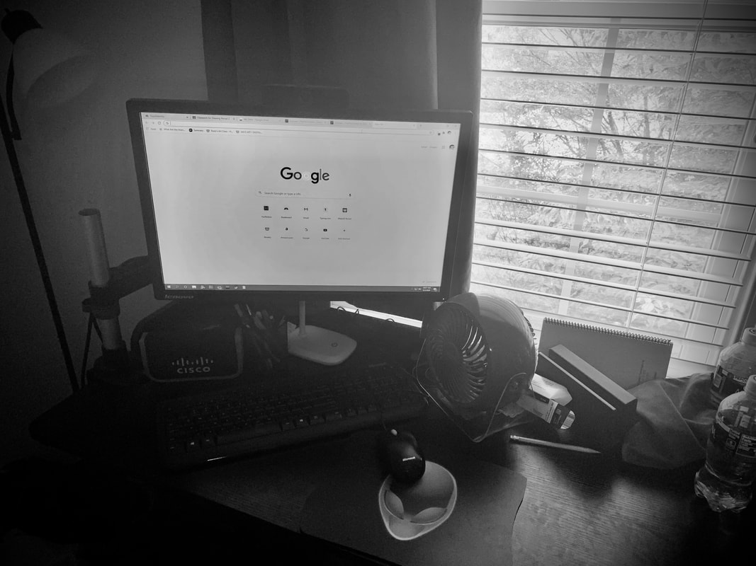
This is a picture of my computer, which I spend a lot of time on. It is turned on because it's on more often than not. I tried to make everything look old and uninteresting except for the outside of the window, which is made to look brighter than the rest of the image to look more desirable than everything else.
|
|
|
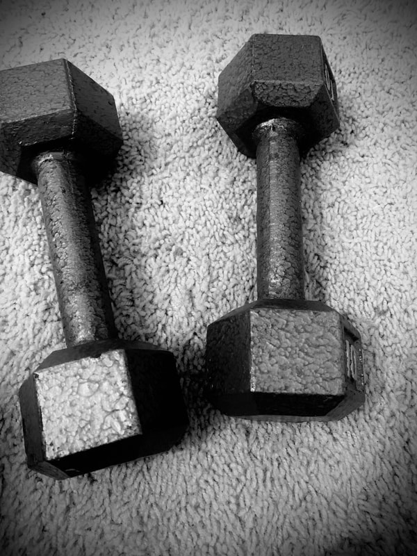
Since swimming season ended around the time school started, I have been going to Crossfit a lot, which is significantly harder. I used rule of thirds here and also tried to make it look unpleasant in terms of shadows in contrast.
|
|
|
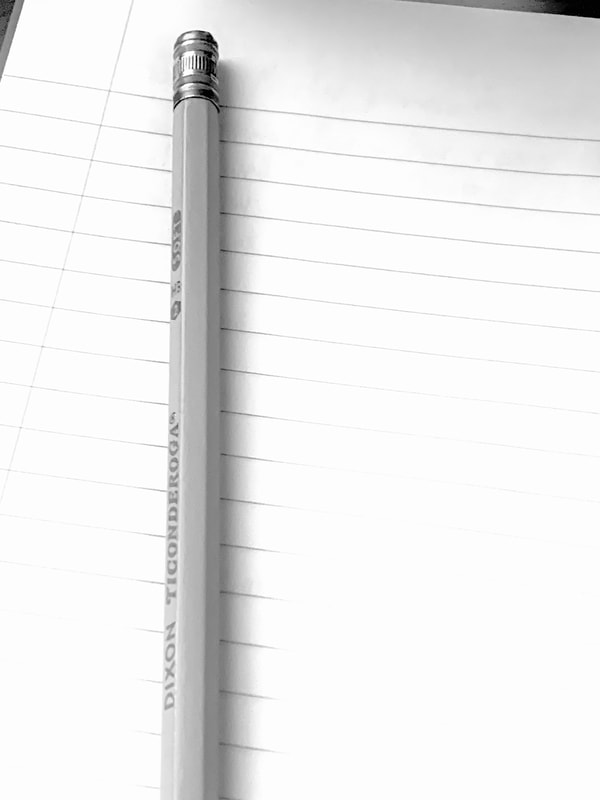
This is a picture of a notebook and a pencil. I included this because I love to write and it has been my main escape through all of this uncertainty. That is why it is much brighter than the other two.
|
|
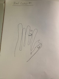
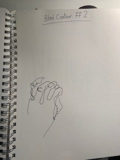
3 Blind Contour Drawings
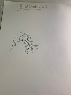
Here, we had to stare at our hand and draw it for 3 minutes, without lifting the pen off the paper and without looking at our paper. When time was up, we looked at our finished products. As expected, they weren't very good, but after doing it a second and third time, there was noticeable improvement.
|
|

|
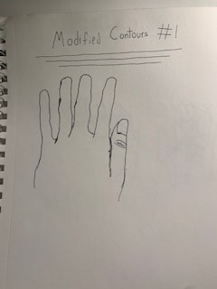
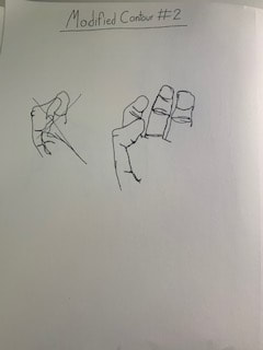
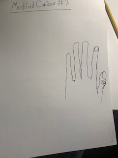
3 Modified Contours
Next are the modified contours. They were similar to the blind contours except you could look at the drawing to in order to be more accurate. These unsurprisingly turned out much better than the blind contours.
|
|
Drawing from Objects
These are the notes that I took from the drawing book about drawing from objects. There are details about lines, charcoal types, and other vocab.
Shoe and Backpack modified contours
Similar with the hand modified contour, these both are pen drawing that were all drawn in one continuous line, without the pen being lifted off the paper. Due to all of the little details, these two drawings were much more difficult than the hand drawings.
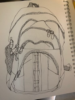
The backpack drawing was the most difficult contour draw since I needed to get all of the little details with the zippers and wrinkles. The fact that this had to be done in one continuous line added to the challenge.
|
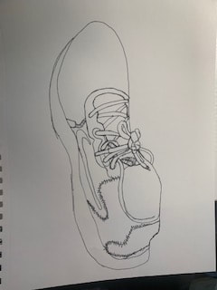
While the backpack was harder to draw, the shoe wasn't any walk in the park either. I did like what I did with the stitching though over everything else.
|
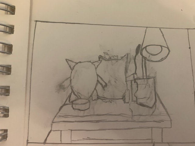
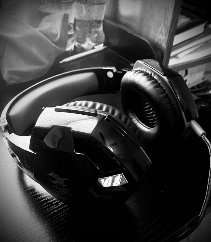
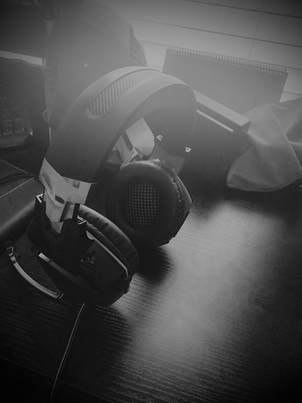
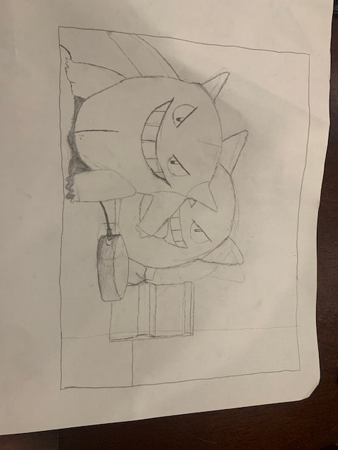
Still Life
Final Reference Photo
Compositional sketches

|
|
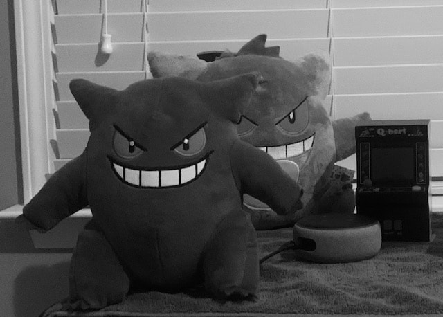
-How important were the compositional sketches? Explain.: The compositional sketches gave me some practice on the shape of the Gengar plushies and they would help me decide what composition would work for me. So yes, they were absolutely necessary.
Work in progress
|
|
|
Final Drawing

: -Describe the craftsmanship of your drawing. (Is it clear, clean edges, blended well, smudges, defined space, etc.): I drew the edges to be very bold and noticeable. Other than that, shading was a primary part of the drawing, though the changes in shade can be extreme sometimes, such as with the Gengar plush towards the back. The shading I'm most proud of is the cloth at the bottom. Up close, it looked really bad, but from a distance it works.
-Are your values and shadows realistic? How many values did you include? How and why are values important?: I tried to be as realistic as possible with my values and shadows, once again, the Gengar towards the back could have been better in the value department. But I do think the few cast shadows are relatively realistic.
-Is there a clear source of lighting?: Towards the front, yes. The Gengar plush towards the back is much darker due to the lack of light hitting it. The light is coming from the right, which can be recognized by the front Gengar plush having more light on its left side.
-How is your final drawing successful?: It effectively shows the viewer everything on the paper with all of the clean, broad edges. They can easily notice the two plushies, mini-arcade, and Amazon Echo. The fabric also turned out well enough to determine what the objects are on top of.
-Are the proportions, structure and perspective of the subject correct?: Mostly, I feel there were a few errors in comparison to the reference photo, but overall, I believe I captured it pretty well, and even though the transition between the photo and the drawing isn't perfect, the proportions of the drawing doesn't look off-putting.
-Does the placement & grouping of objects create a pleasing arrangement (composition)?: Yes, the overlapping of objects and minor usage of negative space creates a generally pleasing composition.
-Is there a center of interest and is it well located?: The center of interest is located where the front Gengar plush is. I think it does a good job of not making the center of interest in the center.
-How well did you manage your time and resources throughout the process of creating this drawing? Do you see where you could improve in this area?: I think I managed my time very well and got something that I was proud of. I worked on it a little at first, then increased my effort the closer the date came.
-What challenges did you encounter during this project and how did you overcome them?: The biggest challenge was drawing the cloth. I actually winged it for the most part until I got something that looked good. Trial and error was all it took.
-What have you learned drawing a still life?: Drawing still life helped me pay more attention to little details and the importance of shading. The skills I have learned will help when I have to draw something realistic.
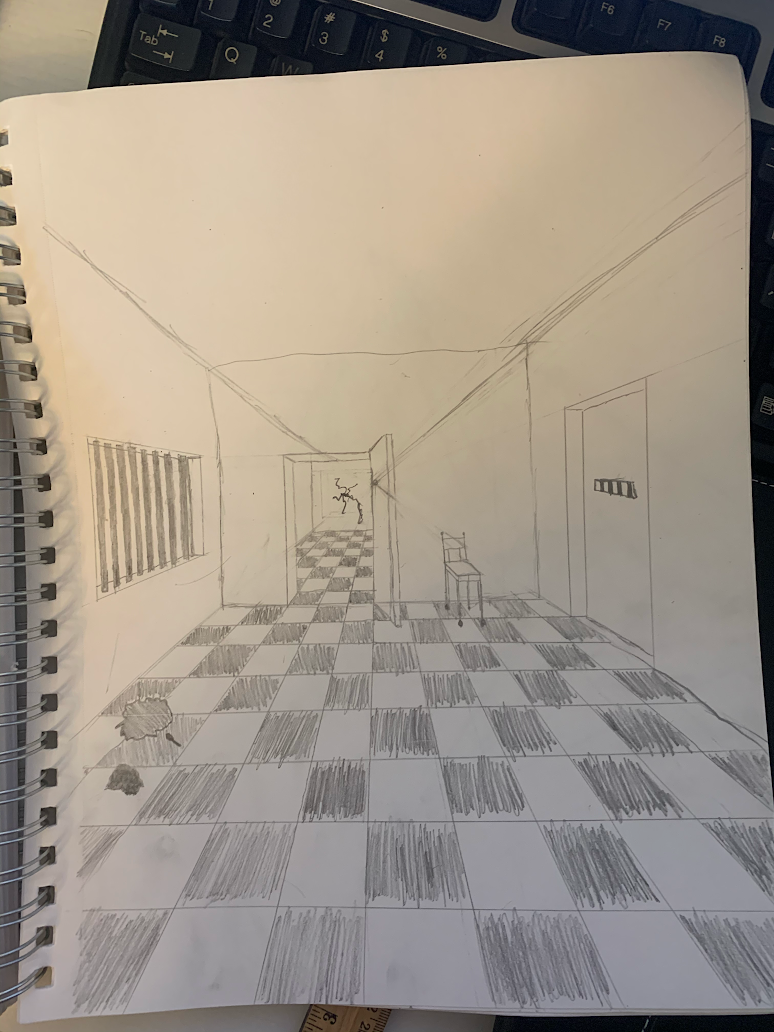
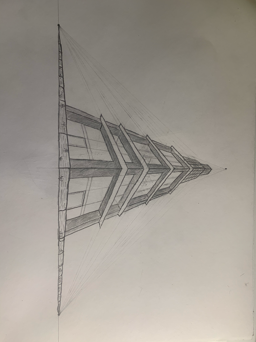
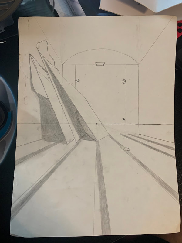
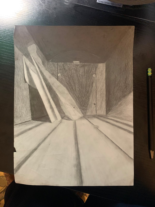
One-point perspective drawings
|
|
These are the drawings we did to practice perspective. We drew two buildings, a road with a curb, a line of trees, and a fence. We used a ruler to draw lines that all centered in on the vanishing point, which was located on the horizon line. Along with the city scene, we also drew a room, which was much harder since there was a lot more to erase. For the room, I decided to turn it into a prison cell, hence the bars and hole over by the left side of the drawing. Overall, perspective helps us create an accurate 3D scene that would be difficult to create in any other way.
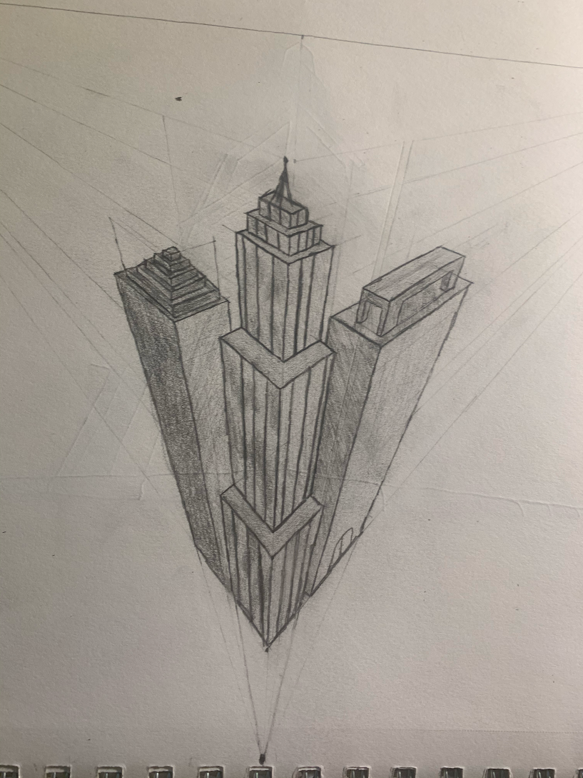
Two-point perspective
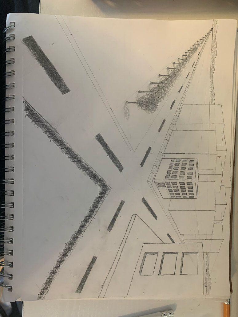
For this drawing, we made a horizon near the top just like with the one-point perspective drawings. Instead though, there are two points where line converge. An intersection on the road is the most common two-point perspective drawing to do.
3-point perspective
# point perspective has three vanishing points. Two of them are near the ends of the horizon line while one of them is located above or below the middle of the horizon line. Only vertical lines in the center of the drawing stay vertical, while everything else heads towards one of the vanishing points. The two styles most commonly associated with 3-point perspective drawings are worms-eye view and birds-eye view.
Forced Perspective
Forced perspective is the arrangement of objects in a photo that throws the perception of the viewer off, making objects appear bigger or smaller than they actually are. Forced perspective also expands out of the size category, but those instances are usually much trickier to pull off.
Look at that view
Brainstorming ideas
- Worms eye view of a computer tower.
- Two-point perspective of my house
- Birds eye view of my lamp
- Birds eye view of my bookshelf
- Worms eye view of my stairs
- One-point perspective of my banister (also shows windows and parts of the room past the banister)
- A close-up of my keyboard from a side perspective
- One-point perspective of a storm drain
- Worms eye view of my backpack
- Close up of a mini-fan
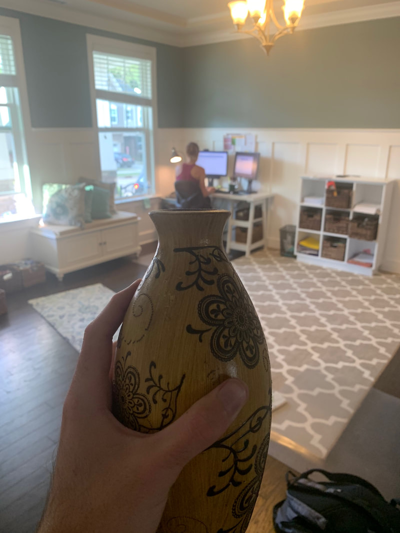
- Two-point perspective of a playground
- Two point perspective of my mini arcade
- Birds-eye view of the inside of my computer bag
- Worms-eye view of a mailbox
- Two-point perspective of my bed in my room
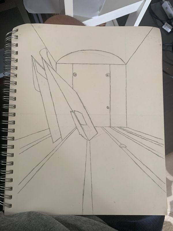
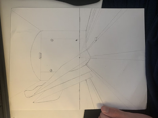
I ended up picking number 14 in the end, but instead of a worm looking up at a mailbox, I would do someone looking inside of the mailbox
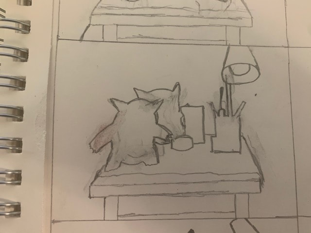
Sketch
In progress photos
|
|
Final
Self evaluation
1. Describe how you created an interesting point of view? Was it successful? Why or why not?
For this piece, I noticed that without the letters inside, it looked like the inside of a large truck. Putting the letters in would give away that it was a mailbox, but as a drawing, it would be difficult to tell, especially when I positioned the camera at the bottom of the mailbox. I believe I was successful in creating a unique perspective that a lot of people find themselves in but cannot pinpoint off the top of their head.
2. Why is it important to understand perspective and how to draw it?
Perspective can either help the audience understand what the drawing is of and create realistic proportions, or it can be used to throw the audience off and make them think the drawing is of something else. The fact that I didn't include any part of the mailbox outside masks what the picture really is, putting the viewer in a unique perspective.
3. How were the pencil and perspective exercises important in the success of your piece?
I'm glad I sketched before doing the final drawing, the proportions were a bit off in the initial sketches and I'm glad I got to figure out how to do them properly in time for the final drawing.
4. Describe the craftsmanship of your piece. What techniques were used? (How well the project is technically crafted).
I used the shadows in the photo to create a realistic perspective for the final drawing. Originally the shadows were much lighter, making them difficult to identify as shadows until I went in with darker pencils to make the shadows stand out.
5. Were you able to achieve depth by showing a foreground, middle ground and back- ground? Explain.
Yes, by using shadows and shading, I was able to create a 3D drawing where the viewer can tell where each thing is in the drawing.
6. Explain your experience with using perspective and the project in general. What were the obstacles and advantages?
Thanks to using the perspective techniques that we learned in class, I was able to correctly place the bumps on the floor of the mailbox. I had trouble with the envelopes because they were leaning and didn't accurately line up with the vanishing point, but I managed
7. Looking back on the progression of this project, what skills, techniques or other information would you like to have been taught? Do you feel you were prepared for this project?
Yes, everything I learned during this project aided me in the final drawing that I ended up creating. I had worked with perspective before, but I wouldn't be able to create this drawing without the exercises that we took part in.
Colored Pencil Forms
|
|
|
As an introduction to colored pencil art, we drew a series of shapes, particularly cones and spheres. We used a few colors for each shape and attempted to create proper blends between colors in order to make the lighting and shadows look realistic. In these drawings, the colors look banded together and not blended properly, but my skill in this would increase as the unit continued.
Colored Pencil Fruit
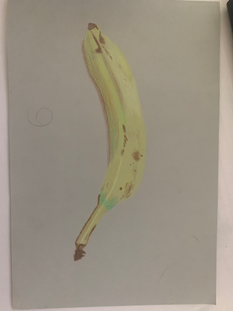
For our next colored pencil assignment, we were tasked with drawing a fruit or veggie. I selected a banana as they are my favorite. When I was first drawing it, I found it a little difficult to create lines that made it look 3-D as well as finding proper blends or green, yellow, and brown. I managed in the end though, and my teacher notified me that drawing bananas could be pretty difficult, so I'm quite satisfied with how this piece turned out.
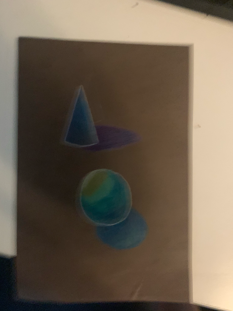
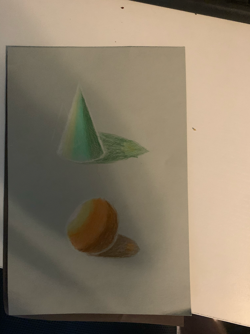
Pastel Forms
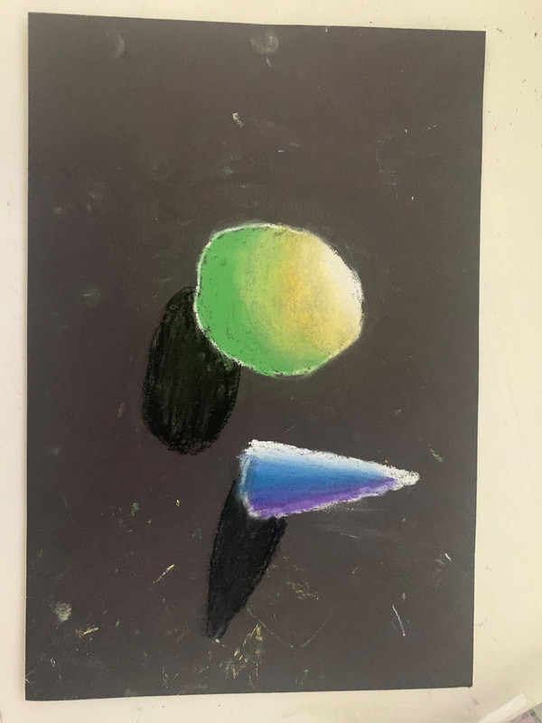
We're drawing shapes again! This time however, we are using the chalkier pastels. Once again, we made a sphere and a cone and cast a light on one side. Overall, I think these turned out better that the colored pencil forms as the banding here isn't as bad and the blending is a little better.
Pastel Eggs
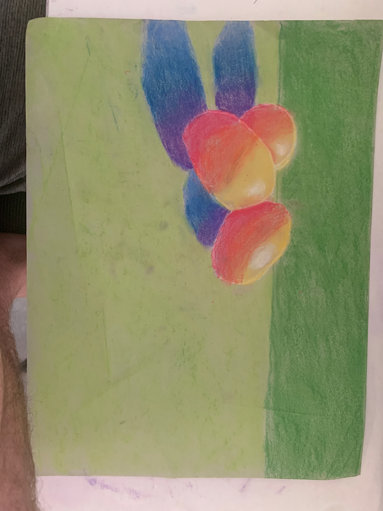
Next we drew some eggs with a light source with pastels. While I think the shadows are well blended together, the eggs themselves definitely suffer from 'banding' and could have been better blended, especially the yellow into the orange.
Wrapped Candy
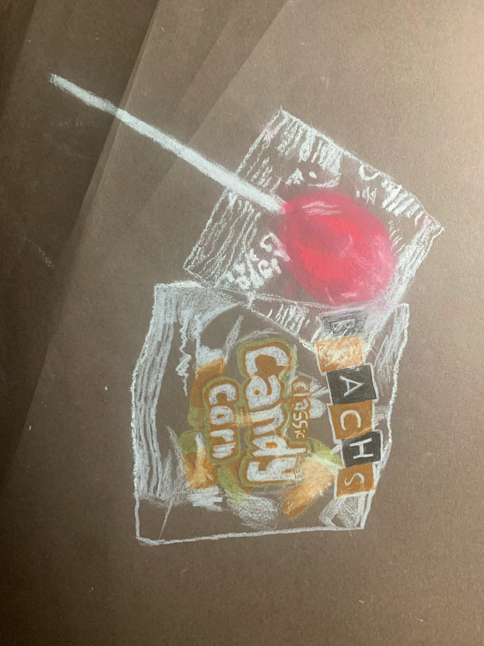
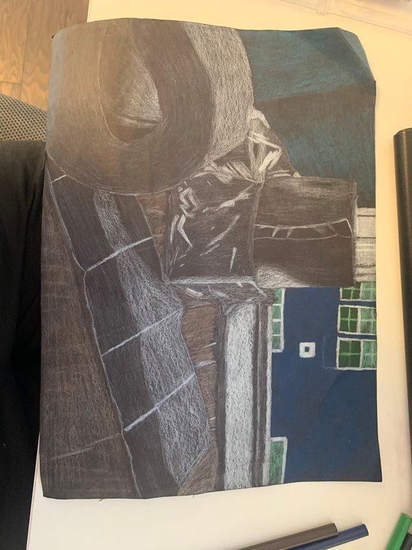
The final mini-project we were assigned in the colored pencil unit was drawing a few pieces of candy with clear wrapping. I selected a lollipop and a bag of candy corn. This was to practice making see-through objects such as wrapping and glass. I struggled aq fair bit with where all of the white should be, but I believe it turned out pretty well, especially the candy corn bag.
Look What I Can See Through
Brainstorming Ideas
- Prismacolor pencils container, a few are outside of the the box
- Grocery bag filled with fruit (spilled over)
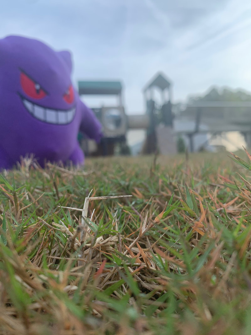
- Mini arcade machine (Inside see-through box)(From the PoV of a worm looking up.)
- Three water bottles (One tipped over, one with a different brand.)
- A solid clear container of cereal.
- A clear bag of tortillas on a surface (With one tortilla placed somewhere to the side.)
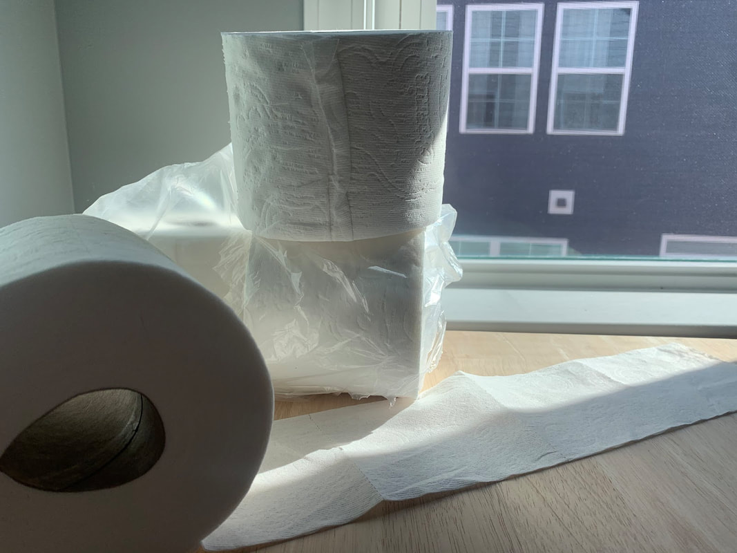
- A nearly empty package of toilet paper :^) (The clear packaging would be misshapen, which would make it interesting.)
- A opened package of Club Crackers. Ones towards the front of the open side have fallen over
- Container of parmesan cheese (opened, spilled)
- Bag of asiago cheese bagels standing up, the bag is pushed down so only half of the bagels are actually seen through the bag, the rest are outside of it.
- POP! Vinyl container (From a side PoV) (Inigo Montoya)
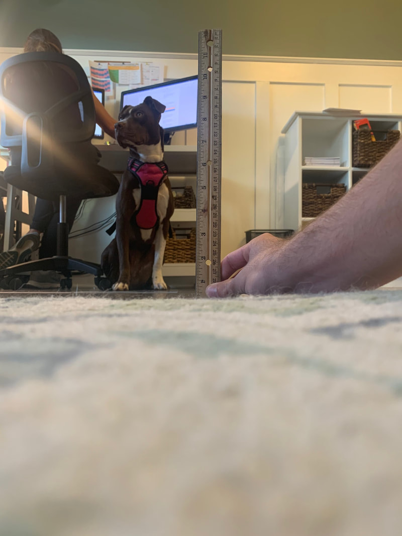
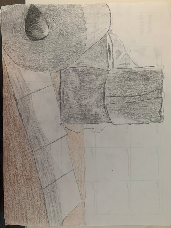
Photo + Final Sketch
|
|
In Progress
|

|
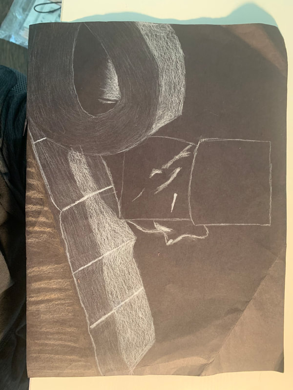
Final
Self-evaluation
- Describe the craftsmanship of your drawing. (Is it neat and well executed?) - The colored pencil is pretty rough in certain areas, especially the white as it isn't completely solid. The brown is also not completely solid as well. But I believe the lighting was well-done and the transparent parts were actually well done.
- Describe how you created the look of transparency. - I made all of the reflected light on all of the wrapping take priority over anything behind it so that it would look like the object is behind something, even if it is transparent. A light layer of white color was also used to make the wrapping look more obvious.
- Describe your choice of colors/color harmonies and how you used them throughout the artwork. - White was the main color in this piece as it was the color of the reflected light on the wrapping and the toilet paper. Other colors were used to separate the white from other areas it is not a part of to make it pop out a bit more.
- How did you create contrast in your drawing? - It's easy to tell what the focus of the drawing is with all of the contrasting color around the toilet paper. Other parts of the drawing that are white have a different value as to not confuse the person viewing the piece.
- How did you use textures, highlights and shadows to enhance your artwork? - The highlights on the wrap helped create the image of a transparent object. The shadows underneath the unfurled toilet paper separate it well from the table underneath it.
- Discuss the importance of understanding the media (prisma or pastels) and acquiring the skills necessary to create a successful project. How beneficial were the mini assignments? The prismacolors really helped me create a piece that I was decently proud of. I was impressed with how well they could be used to make transparent material around an object. The mini-assignments, especially the candy one, really helped me with all the skills I needed to be able to create a piece like this.
- Describe any difficulties you had creating your drawing and what you could do to improve your drawing? - I experienced difficulty with saturating certain parts of the drawing without making it too light. The darker parts of the drawing aren't well-saturated because if it put more color into it, the color wouldn't be right.
Facial Features Drawings
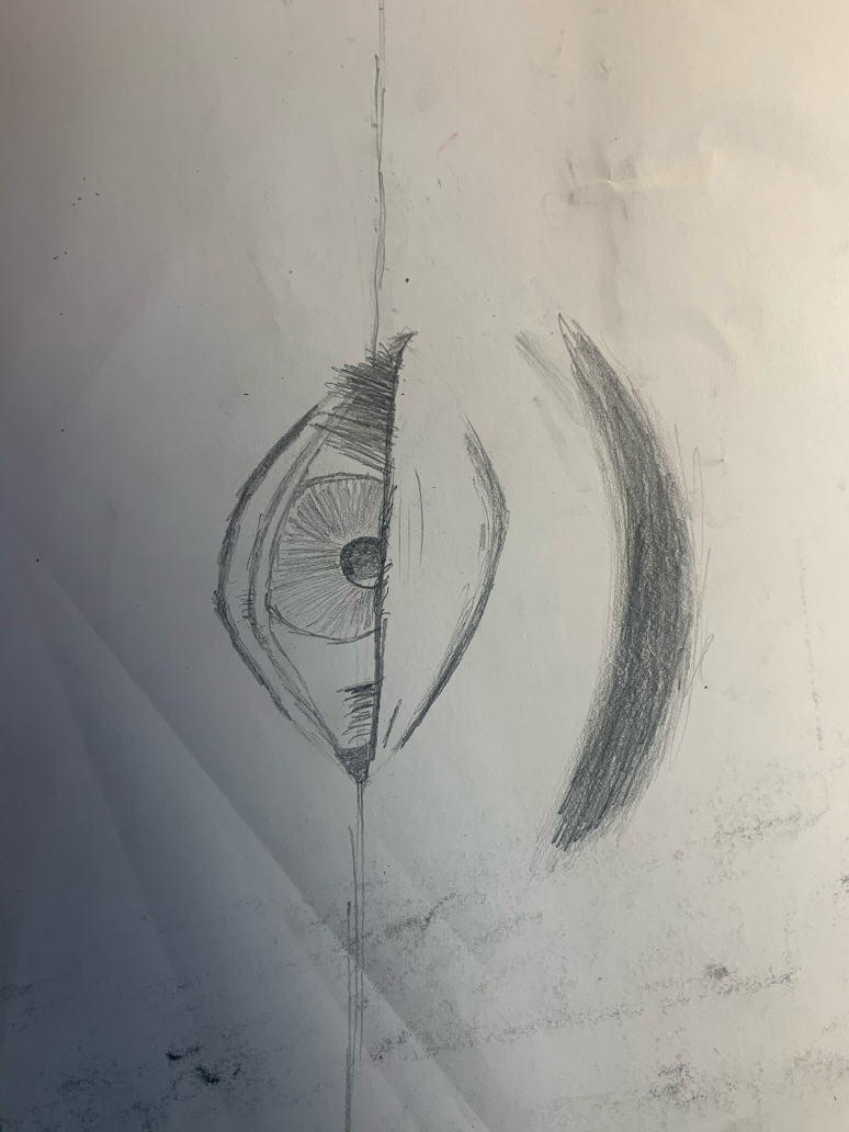
Eye
|
|
In this unit, our final project would be drawing a modified portrait of ourselves, in order to practice, we practiced drawing every body part on the face, starting with the eye. This particular drawing of my eye... isn't the best. I disregarded the shading portion at the end and turned it in basically unfinished piece. But I still gained some useful insight about drawing eyes and applied the full knowledge to the face drawing we would do later.
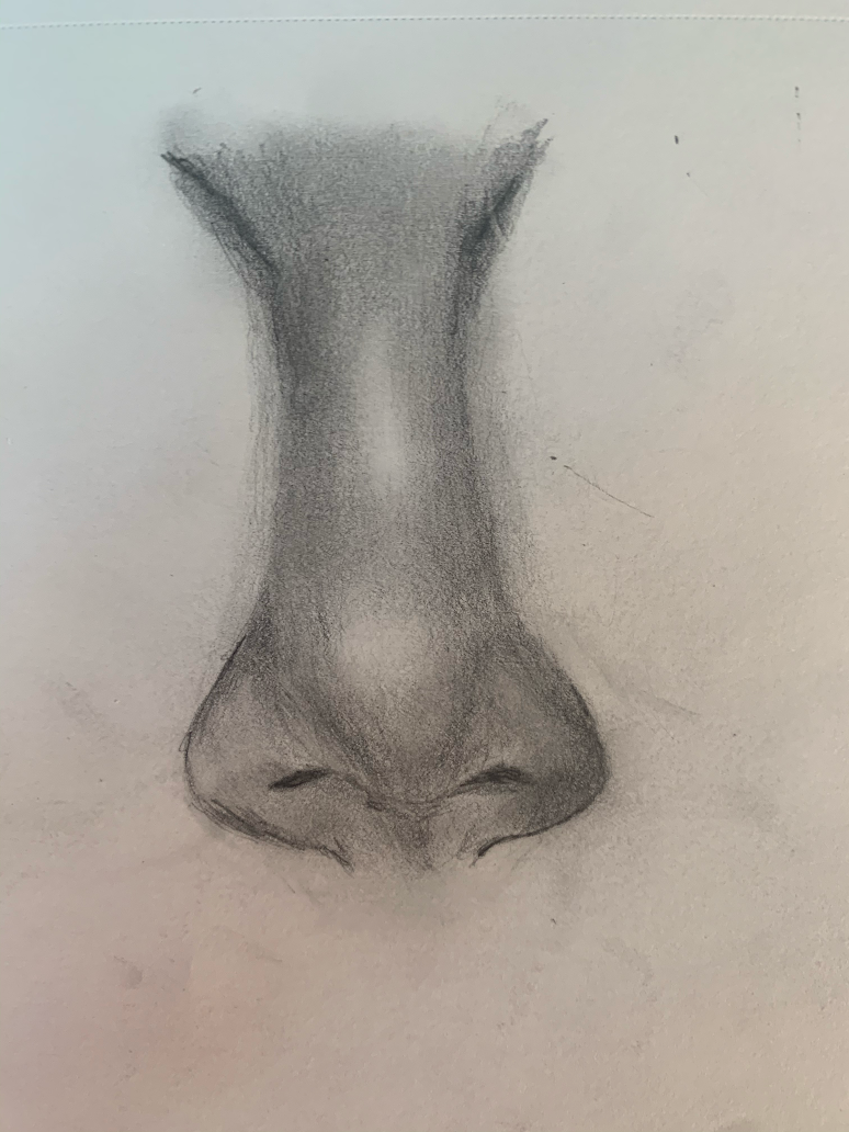
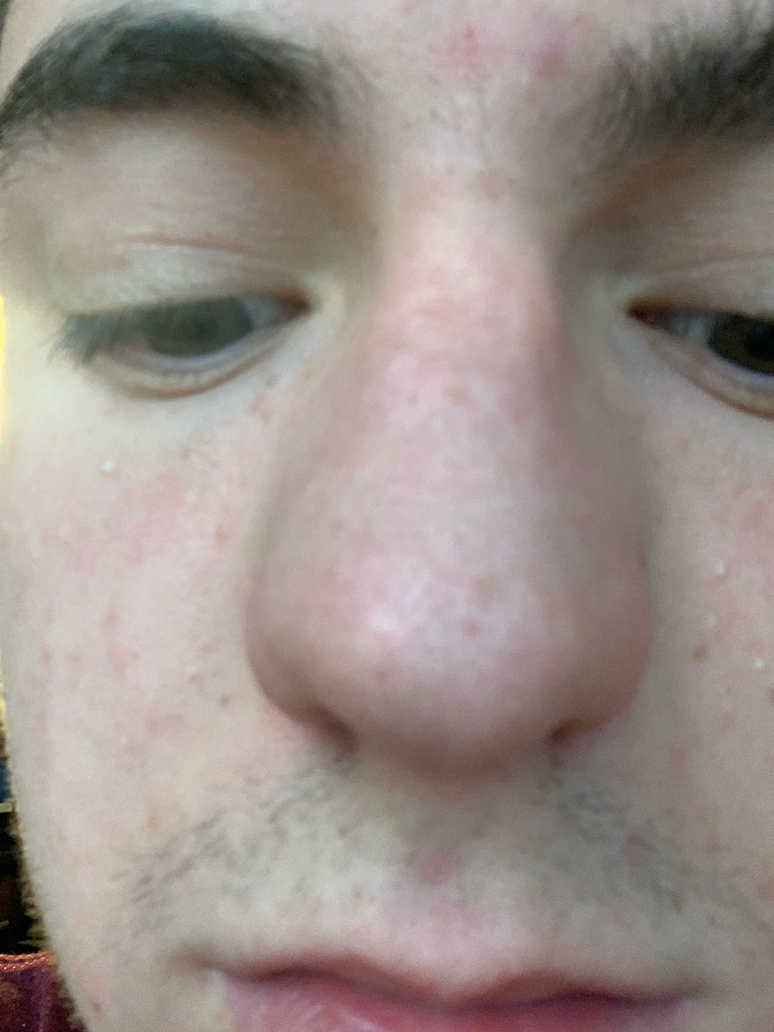
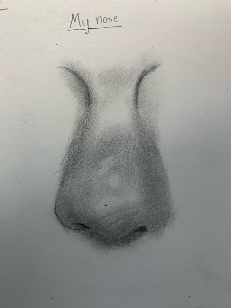
Nose
|
|
|
Next was the nose, and this time, I watched and followed a tutorial before drawing my own nose. This nose turned out a lot better than my eye did, I'm quite proud of it. (tutorial on the left, my nose on the right
Mouth
|

|
|
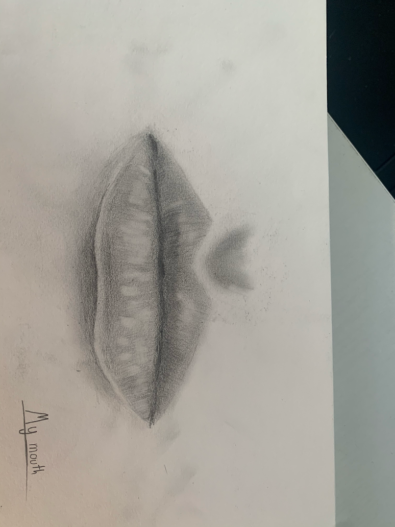
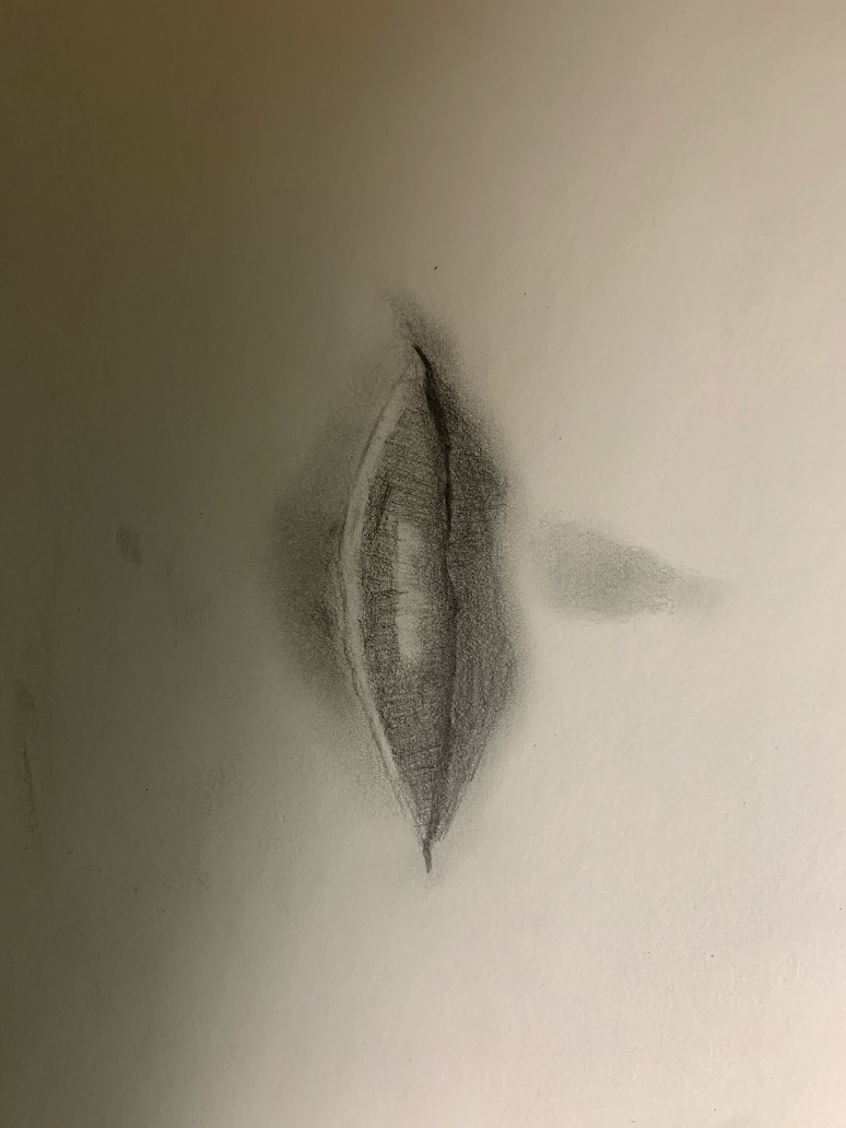
(IMPORTANT: The drawing with "my mouth" written on it is actually the tutorial, not my mouth)
Next up was the mouth, which I found to be the most difficult due to the need for some parts to be more upfront that other parts. I started with the tutorial (left) and then created my own mouth. Up close, I thought my final drawing looked bad, but from I distance, I thought it looked okay, and I'm glad I learned this, especially for when the final project rolled around.
Next up was the mouth, which I found to be the most difficult due to the need for some parts to be more upfront that other parts. I started with the tutorial (left) and then created my own mouth. Up close, I thought my final drawing looked bad, but from I distance, I thought it looked okay, and I'm glad I learned this, especially for when the final project rolled around.
Face
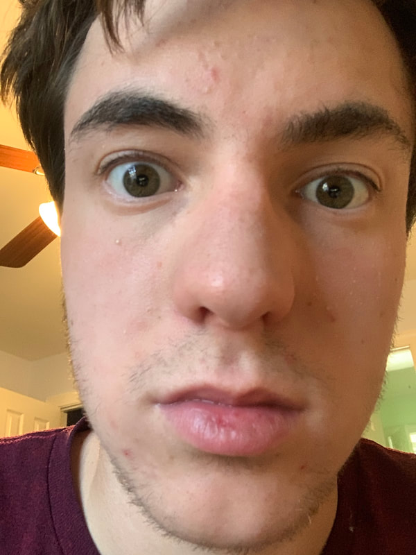
|
|
Now I have to take all of the skills I've learned and combined them into one drawing. I drew the eyes properly this time and both turned out better than my first drawing of an eye in that the eyeballs actually looked spherical. The nose looked good as well since you could tell which parts of it were more elevated than other parts. The bottom lip was a little too big on the mouth, but admittedly, my bottom lip was jutted out a little in the original photo, so it was probably bound to happen. Regardless, I'm happy with how this turned out and I'm now ready for the final.
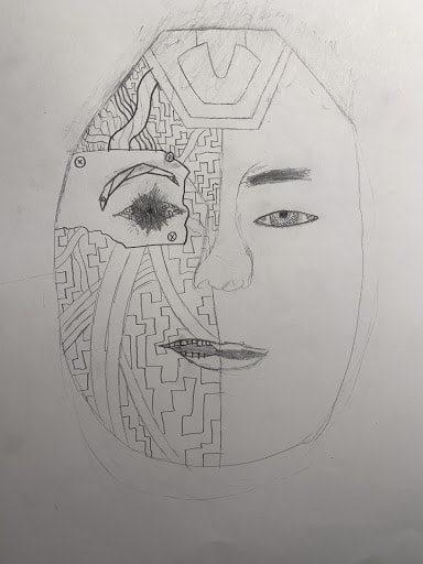
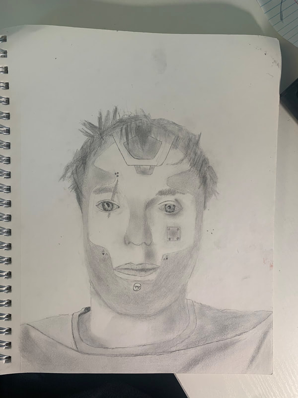
"Self Portrait" Project
Brainstorming Ideas
- Mismatched face that is stitched together
- Portrait where I am very cold. Icicles come from my nose and ears.
- Portrait of me being a old, rusted cyborg.
- Old, rusty spikes protrude from my skin
- One side of my face is normal, while the other side is burned and ruined
- Me having an angry expression with an erupting volcano protruding from my head
- Terrified expression with the colors of my body being pale white (Kinda like a ghost)
- A few sections of my face are elevated a few centimeters above every other feature of the body.
- My hand pulling my head to one side, ripping my neck.
- My hands are holding my head that is severed from my body, I have an uncharacteristically calm expression.
- Normal portrait of me looking really tired
- My face looking wide awake, but I also look like I haven’t slept in awhile.
- (I know it isn’t Halloween anymore but…) the features of my face look like their carved into a pumpkin.
- The top half of my face is normal while the rest is dark and wispy
- My face embedded into a STOP sign
Compositional Sketches
|
|
In Progress Photos
|

|
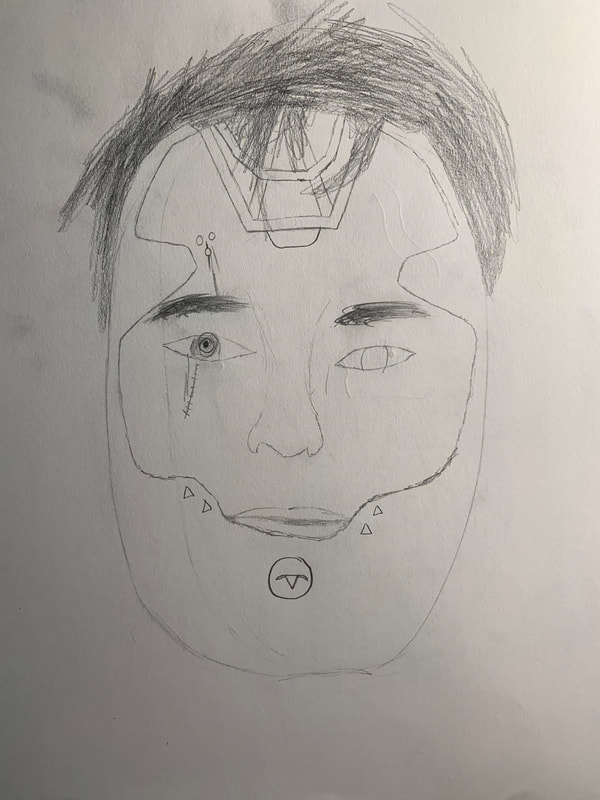
Final Drawing
Evaluation Questions
1. Explain the process you went through to develop your drawing.
Though my pick for what I wanted to do for my drawing was pretty straightforward (A Cyborg), I wanted to do a different version of the concept. I came across an image of a cyborg that looked less modern and decided to base my portrait on it.
2. Discuss your choice of how you represented yourself (mechanical, expressive, stitched together, etc)?
I wanted to make myself look expressionless in order to complete the half-robot look. Though, to add a little bit of character, I made part of my lips droop a bit, like I was partly malfunctioning.
3. Did you achieve a full range of value within your portrait? How?'
I believe I was able to properly use value to convey darker parts of the portrait. The darkest part is a shadowy area where my shirt is blocking the light. However, the hair isn't as dark as it should be, and I feel like I did not use a full range of value within my portrait.
4. Describe your craftsmanship. Is the artwork executed and crafted neatly?
For the most part, I think the artwork is neatly crafted, the only part that is truly messy is the hair.
5. How were you able to capture your look?
By using the exercises I had participated in over the unit, I managed to not only recognize how to craft certain parts of my face, but also add the fictional features of the other image on top of it. (If you look closely, my eyes are slightly robotic)
6. Explain how you made sure you had correct facial feature placement.
I had practiced measuring where facial features go and eventually made a rough outline of where all of my features are. I used this template for my final drawing.
7. Explain the importance of learning how to draw all the features individually.
Trying to learn all of the features at once would prevent us from perfecting any of the individual features. I'm glad we did each individually first, then we combined them into a face later.
8. What part of this unit was the most beneficial and why?
Learning the face was definitely the most important to me. Sure, I had gotten used to drawing each feature on their own, but I needed to be able to combine them all and know where they all were.
9. List any obstacles you had to overcome and how you dealt with them.
The one obstacle that was truly oppressing was the hair, and I am at fault for not using the hair tutorial to practice, butI just tried to focus on making the arrangement of my hair look close to how my hair looked in the photo. It didn't come out perfect, but I do believe it could have been worse.
